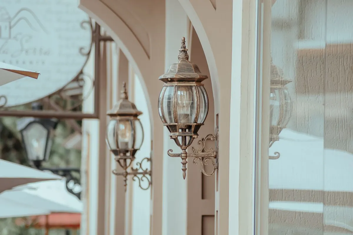
A decorative lantern does more than hold a bulb. It shapes a pool of light on a wall, draws attention to a doorway, and gives a garden table a little ceremony. The bulb inside is part of that composition. Change it from warm white to cool white and the same lantern can feel inviting, clinical, crisp, or slightly theatrical. Neither choice is automatically better. What matters is the mood you want, what the light has to help you see, and how it treats the materials around it.
What Color Temperature Actually Means
Color temperature describes the tint of white light, measured in kelvin (K). Lower numbers feel warmer and more amber; higher numbers feel cooler and more blue-white. The ranges are broad, but these landmarks help:
- 2200–2700K: candlelike to warm white, with a soft amber cast.
- 3000K: soft warm white, slightly cleaner than 2700K but still cozy.
- 3500–4000K: neutral to cool white, clearer and more alert.
- 5000K and above: daylight white, crisp and sometimes blue.
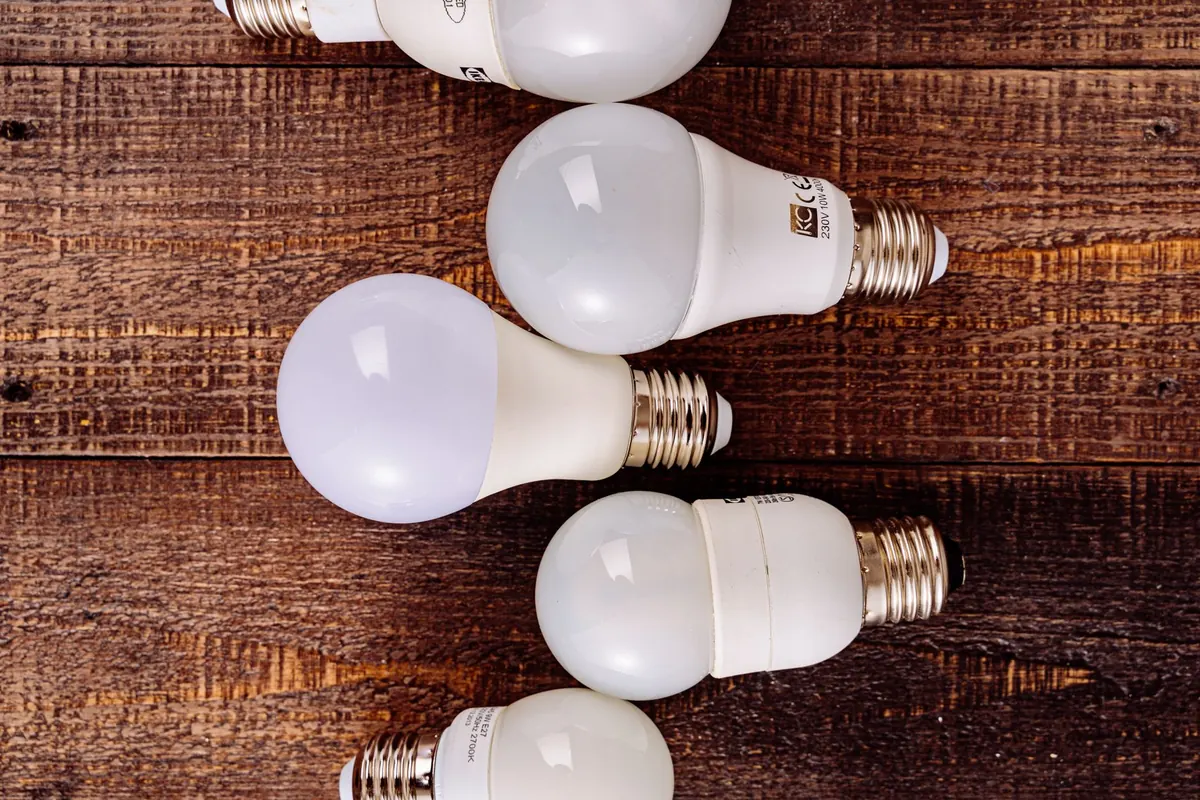
A box that says “warm white” may cover a range. Look for the kelvin number, and compare lumens too. A warm bulb is not automatically dim, and a cool bulb is not automatically brighter. Color temperature changes the feel; lumens change the amount of light.
Warm White: The Case for a Softer Glow
Warm white is the natural starting point for most decorative lanterns. At 2700K, light flatters brass, copper, aged wood, terracotta, and amber glass. It makes a porch feel like a welcome rather than a checkpoint. In a dining room or on a sheltered terrace, it pulls people toward the lantern and softens the edges of the space.
At the lower end, around 2200–2400K, the effect becomes more candlelike. That can be beautiful in a lantern with frosted glass or a visible filament bulb, especially when the lantern is used as an accent rather than the main light. The trade-off is color accuracy: deep blues and greens can look muted, and a very warm bulb in a small, bright lantern can make white walls look cream.
Warm light also influences visibility. It is comfortable for evening conversation and relaxed movement, but it is not the best choice when you need to read fine print, sort dark cables, or check a path for uneven stones. For those jobs, use a higher lumen warm bulb or add a second, cooler task light nearby. If the lantern is dimmable, check that the bulb dims smoothly; some warm LEDs shift toward amber as they dim, which suits a lantern beautifully, while others flicker or drop out.
Cool White: Clarity, Crispness, and a Different Mood
Cool white begins to feel neutral around 3500–4000K and distinctly crisp at 5000K. In a decorative lantern, it can look modern and precise, particularly with black metal frames, clear glass, and white or gray walls. It sharpens shadows and makes edges read clearly, which is useful at an entry where keys, steps, and house numbers need to be seen.
The risk is atmosphere. A high cool-white bulb in a lantern that was meant to glow can make brass look pale, amber glass look flat, and stone look gray. In the evening, a 5000K bulb outdoors can feel like a security light rather than a decorative one. If you want cool light without the clinical edge, 3000–3500K is often the more forgiving middle ground. It gives a cleaner look than 2700K while keeping some warmth in the scene.
How Light Changes the Look of Glass, Metal, and Stone
The same lantern can look quite different depending on the bulb behind the glass. Before you decide, hold a bulb near the lantern after dark, or buy one and test it before committing to a full set.
The material test
- Clear glass: warm white gives the glass a honeyed edge; cool white makes it look cleaner and more graphic. Dust and fingerprints show up more under cool light.
- Frosted or opal glass: warm white produces a soft, even glow; cool white looks brighter and more modern but can feel severe in a small lantern.
- Amber or seeded glass: warm white deepens the amber tone; cool white can neutralize it and make the glass look duller.
- Brass and copper: warm light enriches the metal’s natural glow; cool light can make it look paler or more yellow-gray.
- Black metal: cool white emphasizes the frame’s lines and creates a crisp silhouette; warm white softens the contrast.
- Brick, stone, and stucco: warm light flatters texture and color variation; cool light reveals mortar lines and can make the surface look cooler and harder.
Color rendering matters here too. A bulb with a high CRI—look for 90 or above where color is important—will keep wood, fabric, and painted finishes closer to how they look in daylight. A low-CRI warm bulb can make everything look muddy, while a low-CRI cool bulb can make a room feel strangely flat.
Matching the Bulb to the Room and the Job
Start with the lantern’s location and what people do there. A few practical matches:
- Living room, dining room, bedroom: 2700K, dimmable, with enough lumens for the size of the lantern. Aim for a soft pool of light rather than a bright beam.
- Porch or entry: 2700–3000K for welcome, or 3500–4000K if steps and keys need clearer visibility. Choose a bulb rated for the fixture’s damp or wet location.
- Modern hallway or stairwell: 3000–4000K can keep black frames and white walls looking crisp without going blue.
- Display or accent lantern: 2200–2700K with a visible filament can make the bulb part of the decoration, provided the fixture is designed for it.
- Outdoor path or garden: keep the temperature consistent from lantern to lantern, and avoid aiming a bright cool bulb toward seating.
Use lumens, not watts, to judge brightness. A bulb that is too bright for a small lantern will wash out the glass and flatten the effect, no matter how good the color temperature is. A narrower beam can concentrate light where you need it, while a wider beam fills the lantern more evenly.
Practical Checks Before You Buy
- Read the kelvin and lumen figures, not just the words on the front of the box.
- Confirm the bulb shape and base fit inside the lantern, including room for heat and for the glass to close.
- Check dimmer compatibility if the lantern is on a dimmer; not every LED dims smoothly.
- For outdoor lanterns, check the fixture’s location rating and the bulb’s suitability for enclosed or damp fittings.
- Buy one bulb first, test it at night in the actual lantern, then order the rest.
- Keep the temperature consistent across matching lanterns; a mix of 2700K and 5000K on one facade looks accidental.
A Simple Way to Choose
For most decorative lanterns, begin with 2700K. It is warm without being orange, flattering to brass and glass, and comfortable after dark. Choose 3000K if you want a slightly cleaner look, 3500–4000K for modern settings or entries where visibility matters, and reserve 5000K for places where crisp clarity is the priority. Then test one bulb in one lantern at night. The right choice is the one that makes the space feel finished—and lets you see what you need to see.
Photo: Antoni Shkraba / Pexels